- Emil
Feature type
Feature elements all have distinct special functionalities.
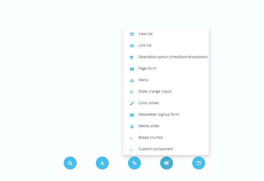
Feature elements all have distinct special functionalities. Feature elements can be added by accessing the feature type element button within the element type menu.

Link list
Link list displays a field where a link to a folder can be added. By default - it retrieves all articles directly underneath specified folder/module.

| Settings name | Instructions |
|---|---|
| Display type | Select how the folder/module is specified. - Static choice - Active folder - Active parent - Active module - Administrator chooses folder |
| From module (Static choice) | Set from which module to fetch articles from. |
| From folder (Static choice) | Set from which folder to fetch articles from. |
| Max amount | Set how many articles included in output. Leave empty for all the be included. |
| Sort order | Select what attribute affects the order of the articles. - Sort order - Label - Show date - Created - Random |
| Reversed order | Set wether order is reversed or not. |
| Include articles from children folders | Set wether articles from children folders are included in output. |
| Load full-scale content | Set wether all content are included from the articles in output. |
| Hide articles | Set wether articles are included in the output. |
| Thumbnail width | Set the width of the thumbnail in px. |
| Thumbnail height | Set the height of the thumbnail in px. |
| Thumbnail type | Set the type of the thumbnail. - FixedSize = Resizes proportions - DynamicSize = Retains proportions and ensures the whole image is visible. - FixedSizeAutoCrop = Retains proportions by cropping. - CropToSize = Crops image to the desired thumbnail width and height. |
| Exclude active | Set wether to include active article in output or not. |
| Limit to color | Set wether to only include articles marked with specific color. |
| Only show future | Set wether to include articles with later show date than current in output. |
| Only show previous | Set wether to include articles with previous show date than current in output. |
View list
View list displays an input where a link can be added. By default - it retrieves all articles directly underneath specified folder/module.

| Settings name | Instructions |
|---|---|
| Display type | Select how the folder/module is specified. - Static choice - Active folder - Active parent - Active module - Administrator chooses folder |
| From module (Static choice) | Set from which module to fetch articles from. |
| From folder (Static choice) | Set from which folder to fetch articles from. |
| Max amount | Set how many articles included in output. Leave empty for all the be included. |
| Sort order | Select what attribute affects the order of the articles. - Sort order - Label - Show date - Created - Random |
| Reversed order | Set wether order is reversed or not. |
| Include articles from children folders | Set wether articles from children folders are included in output. |
| Load full-scale content | Set wether all content are included from the articles in output. |
| Hide articles | Set wether articles are included in the output. |
| Thumbnail width | Set the width of the thumbnail in px. |
| Thumbnail height | Set the height of the thumbnail in px. |
| Thumbnail type | Set the type of the thumbnail. - FixedSize = Resizes proportions - DynamicSize = Retains proportions and ensures the whole image is visible. - FixedSizeAutoCrop = Retains proportions by cropping. - CropToSize = Crops image to the desired thumbnail width and height. |
| Exclude active | Set wether to include active article in output or not. |
| Limit to color | Set wether to only include articles marked with specific color. |
| Only show future | Set wether to include articles with later show date than current in output. |
| Only show previous | Set wether to include articles with previous show date than current in output. |
Selectable option (checkbox/dropdown)
Selectable option displays a dropdown or a checkbox depending on the amount of options. The administrator can choose one of the options or toggle it on or off.

| Settings name | Instructions |
|---|---|
| Option | Set the input options. Displays a dropdown instead of a checkbox if the count of options is greater than 1. |
| Option - Key / Label | Set the input options. Displays a dropdown instead of a checkbox if the count of options is greater than 1. |
| Preselected | Select wether checkbox is selected by default. |
| Preselected (if more than 1 option) | Select which dropdown options is selected by default. |
| Allow multiple options | Select wether content administrators can select multiple options from the dropdown. |
Give administrators choices to customize the content the way they want!
Page form
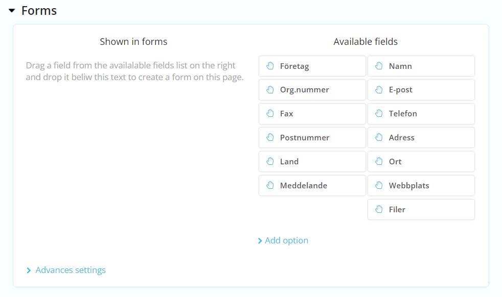
Displays a form editor where inputs that supports different kinds of data can be added. Such as, text input, checkbox or file inputs.
Does not display an input. Instead, retrieves a list of links from the menu module. See default modules for more information about the menu module.
| Settings name | Instructions |
|---|---|
| Level to show | Set the level index to start from in output. Default is 0. |
| Parent id | ? |
| Amount of children | Set the amount of children included in output. |
| Show locked nodes | Set wether locked nodes are included in output. |
Slider (range-input)
Slider displays a range input. Content administrators can choose a number between a min and a max number set by developer.

| Settings name | Instructions |
|---|---|
| Minimum value | Set the minimum value for the slider. |
| Maximum value | Set the maximum value for the slider. |
| Value type | Set the type of value for the slider, such as "px", "em", etc. |
| Add number field | Set wether to allow setting the number directly. |
Color picker
Color picker displays an input where a color code can be added.

Newsletter signup form
Does not display an input. Instead, retrieves data related to the newletter module.
Breadcrumbs
Does not display an input. Instead, retrieves a list of links that represents the current view and it's ancestors.


